Free custom dashboard for COVID-19 data in Excel using data from web, pivot tables and graphs

We live in the challenging and unprecedented time. All the world is battling against invisible enemy called COVID-19 or corona virus. Unfortunately the dynamics of the spread is too fast. Now new daily routine for most of us is to check the latest news an statistics regarding the disease. As we live in the connected world we might have relative and friends all across the globe.
I wanted to access the latest data about the cases across the countries where my friends or relatives are living in a simple way as currently I need to browse through multiple sources to get the latest information. Not only I want to see the graphs published in the media but quickly run my own queries to get the better picture of the situation.
I have decided to create a simple Excel spreadsheet which contains all the data which can be quickly updated. Of course I can use all the power of Excel such as filters, pivot tables, graphs to create a dashboard I want.
The spreadsheet is hosted on GitHub, you are welcome to download, modify or contribute to it. I will be updating the spreadsheet and adding new charts. If you have any particular requirement please do not hesitate to send your request to our e-mail or submit the ticket to GitHub.
COVID-19 Excel Dashboard
You can download the free dashboard by the link below:
Graphs are located at the first Dashboard spreadsheet
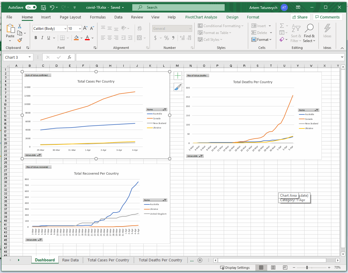
All other tabs contain the raw data which graphs are linked to. Data is pulled from the web source and updated 3 times a day.
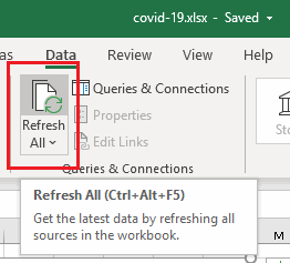
Refreshing Data
Click Refresh All button to pull new data from the server and update all tables and graphs. All of the graphs will be instantly updated.
Note, in some cases you need to click the Refresh button multiple times
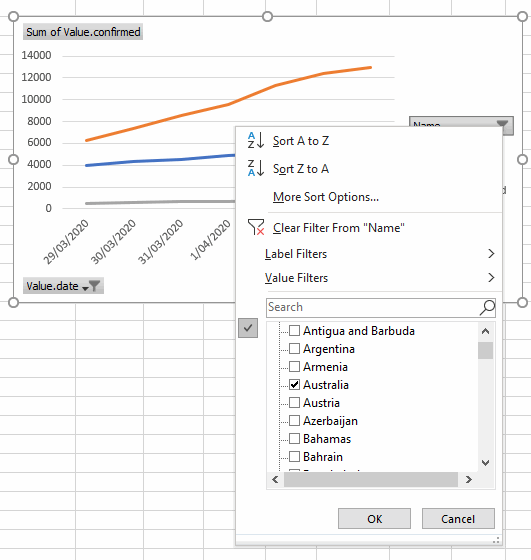
You can modify the filters of your graphs as per your needs:
Filtering Date
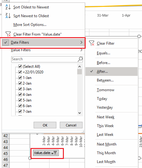
Specify the time range of the data you are interested in. You can use predefined placeholders such as last week, last month or specify a custom period.
Filtering Countries
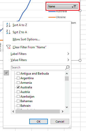
Select the countries you want to monitor by adjusting the filter.
If you remain in self-isolation like many others across the globe you can use this time to learn new things. Below is a detailed explanation of how to build this dashboard. By following this tutorial you might learn new things:
- How to load the data from the web service
- How to pre-process the data and transform into readable Excel table format
- How to use pivot tables to further transform the data to fit the graphs
- How to create graphs and filter data to display dynamic dashboards
How to create custom dashboard
At first you need to decide what would be the source of your data. This can be a simple excel table which you will update manually by typing values in or copy-pasting. This can be a database or web-service.
In this tutorial I will show how to create a data source from web-service, transform it and create filterable graphs.
I have decided to go with the data provided by this source. It appears to be accurate, updates 3 times a day and contains the historical data which is required for my dashboard.
Data, returned from the web-service API is a simple JavaScript Object Notation (JSON) file which contains the data of confirmed cases, recoveries and deaths per country per day.
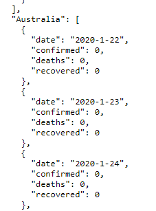
The file is structured in the following way:
Country A
  date
  confirmed
  deaths
  recovered
Country B
...
Of course this file in the row format will not give us much power except of simple searching through the text.
Let's import and transform this data in Excel.
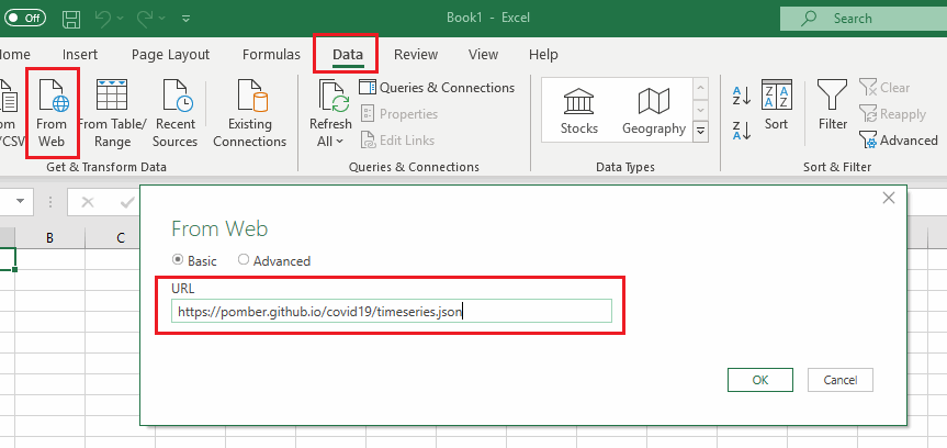
Firstly, lets import the data source from the web-service. It is as simple as selecting the From Web command from Data tab and specifying the url to the web service.
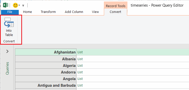
Excel will automatically parse the data and represent it in the readable format. You may notice that this format as slightly different from the typical table data as usually (and in this case in particular) data from web API is represented as tree (in XML or JSON formats), but not a table. That's why you can see the List and Record hyperlink appearing in each row which will navigate inside that record once you click it. It is now our task to transform this data to be presented as a table.
Let's click Into Table button to start the process
It is not very different now, however you have new Transform tab enabled which can help you to transform the data. There are also shortcut buttons available directly in the column to transform the data.
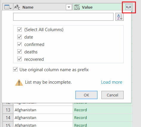
Select Expand to New Rows option to expand each list item to a new row by duplicating the value of the key column.
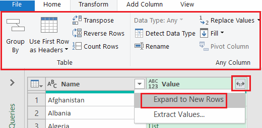
In our case this would expand each day record with data in its own row, duplicating the country in the first column
| Country | Record |
|---|---|
| Country A | Record A1 |
| Country A | Record A2 |
| Country A | Record ... |
| Country B | Record B1 |
| Country B | Record B2 |
| Country B | Record ... |
| ... | ... |
Record itself is a structure containing more specific information which can be expanded to columns
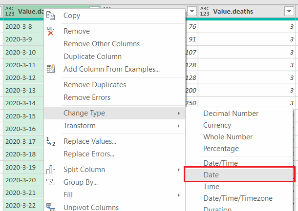
Optionally you can specify the specific type of data associated with each column. For example it would be beneficial to specify Date type for the date column so it can be later used for filtering and grouping:
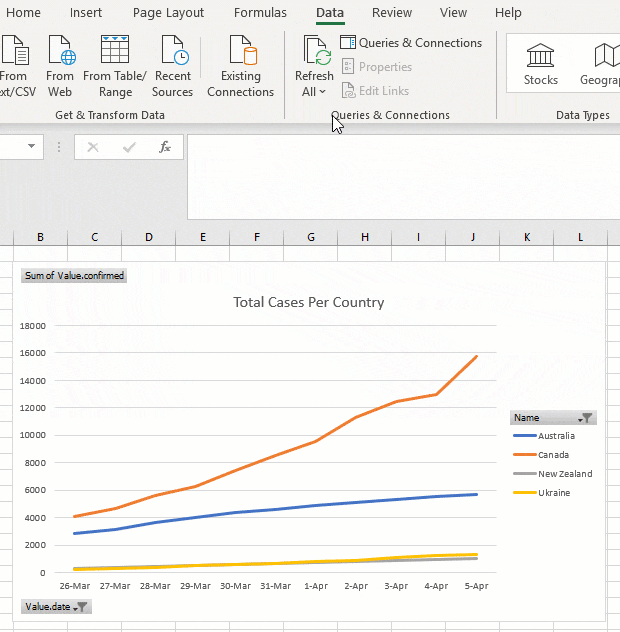
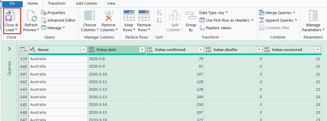
Now our data transformed to the table format and can be imported to Excel:
Now you can add excel feature to query and filter the data such as pivot tables and graphs.
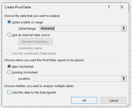
You can create a pivot table from the shortcut of the imported data.
And specify to create in new or existing spreadsheet
Configure PivotTable fields as per your needs. For example the below configuration would display total confirmed cases where rows represent data for each day and columns represent countries.
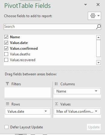
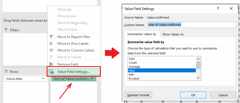
Note, that this particular data set contains the total values of confirmed cases per cell, so it is required to modify the value in the Values box of PivotTable to display Max value instead of Sum otherwise data will be invalid.
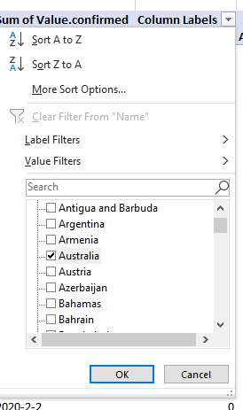
Now you can filter the data in rows and columns without changing the data set
You can also insert an Excel graph and as it is linked to the PivotTable you can easily change the filter directly from the graph
The data is dynamically linked to the source and will be automatically updated when you click Refresh button
Stay safe and healthy.